
NOTE:
This is in document is still being worked on. You can post your comments on this card: https://app.hubspot.com/contacts/487227/deal/1149340271/
Last Updated: 2019-11-26
Below is a UI preview for the VPB Button/CTA/Link. You can use this as a reference whenever you're creating fields related to Hubspot CTAs, Buttons and Links in your VPB modules.
UI Fields
| Label | Field Type | Description |
|
Add Call-to-Action? |
Boolean Field | Allows users to add a Call-to-Action. |
|
Button Type |
Choice Field | Allows users to select from Hubspot CTA (default), Button or Link. |
| Hubspot CTA | CTA Selector Field | Allows users to select from a list of Hubspot CTA buttons/links (These buttons/links are created in Marketing > Lead Capture > CTAs). |
| Button Style | Choice Field | Allows users to choose a styling for the button (shows only if the selected Button Type is "Button"). |
|
Label |
Text Field |
Allows users to add text that will be used as a button label or link text. |
|
Link |
Link Group Fields | Allows users to add different types of link-out (External, Content, File, Email Address or Blog) for the button or link. |
Hubl Implementation
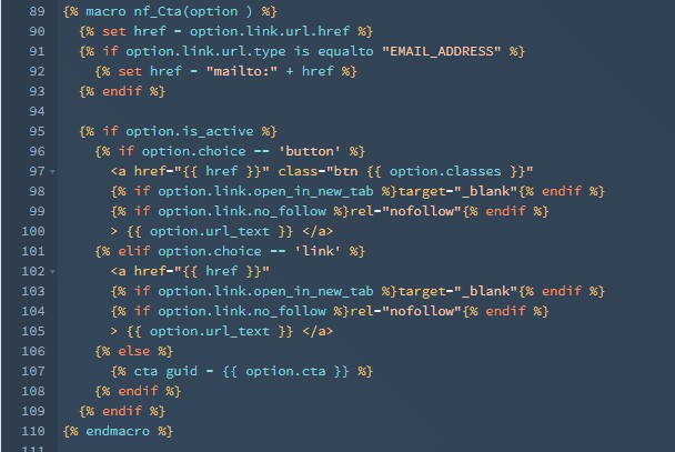
This macro outputs the choice given - Button, Link or Hubspot CTA - with the additional button styles. Please take note that this will only display on your page if the is_active property is set to true.
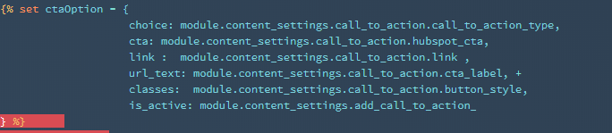
The options to be passed on to this macro are in dictionary or dict format. Below is an example dict of the options to be sent to nf_Cta macro.
| Variable | Description |
|
choice |
Accept values 'button' or 'link'. Element structure will be based on the set value. |
|
cta |
Hubspot CTA ID - value from the Hubspot CTA field. |
|
url_text |
The label for the button or link. |
|
classes |
Additional classes for custom styling. |
|
is_active |
Show/Hide. Will show element when set to 'true'. |