
NOTE:
This is in document is still being worked on. You can post your comments on this card: https://app.hubspot.com/contacts/487227/deal/1149340271/
Last Updated: 2019-11-28
Awesome Pages created by Netfluence are consisted of modules. They are like lego pieces combined to create stunning website pages. These modules can be dragged anywhere on the Netfluence Template or pages created from the said template. Modules were created by thinking through how the end-user would feel when using the module - all possible use-case aligned to their requirements and additional functionality for them to be able to do anything with the module. Module are not only responsive per viewport resolution but also flexible, scalable and maintainable with a click of a button.
So how are these modules built? How are they structured? How do they work with each other? How do they handle styling? We'll be answering these questions in a bit.
In this document, we'll be focusing on the core structure and functionality of each module.
Default Field Grouping
The module's functionality is based on its use-case. In the example above, we have three default field groups. These varies depending on the client requirements. Although most of the custom modules start with these field groups, some modules like Header and Footer don't.
- Content Settings - contains fields used to enter the module/section contents such as text, images, videos, and links/CTA.
- Background Settings - contains fields used to set the module/section background.
- General Settings - contains fields used to set the module/section height, top and bottom padding.
Structure
In order to create maintainable and scalable modules, module structure should be uniform. All development of modules should start from these core elements:
Please take note that for the sample codes, we only used single curly braces for displaying Hubl variables and calling Hubl macro functions as the blog post is interpreting these codes instead of displaying them as simple text when typed with double curly braces. For the comment and logic we added a space between the curly braces and the percent sign as well as between the curly braces and pound sign.
Section
<section id="section_{name}" class="nf-styles-{name} {module.styles.select_theme} {module.styles.background_type} ">
  <div id="{setId(module.general_settings.section_id)}" class="nf-section {module.general_settings.section_class}">
    <div class="nf-container">
      <!-- start your code here -->
      {caller()}
    </div>
  </div>
</section>
The main container for each module is the <section> tag. This contains the unique module/section id, and various classes pertaining to the theme and background settings. Next to the section tag is a div container with the nf-section class. This contains the user-specified section id (can be used for the anchor tags) and class (for additional styling).
Container
<div class="nf-container">
  <!-- start your code here -->
  {caller()}
</div>
The div with the nf-container class is the main wrapper for the module contents. This is where the center container width for each viewport resolution is set.
<div class="nf-row { % if module.content_settings.flip_content % } nf-fr reverse { % endif % }">
  <div class="nf-col">
    { % call content(contentOption) % }
      { # image module # }
      { nf_Image(module.content_settings.image.img) }
    { % endcall % }
  </div>
  <div class="nf-col m-auto">
    { # default heading # }
    { default_headingContent(headerOption, descOption, ctaOption) }
  </div>
</div>
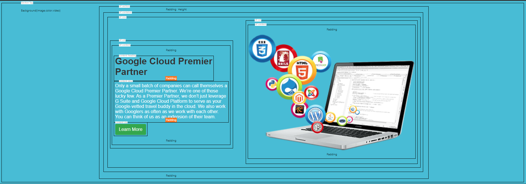
Below are the core classes for structuring a section. These are somewhat similar to Bootstrap. These allow users to control how the contents are presented in various viewports:
| Class | Description |
|
.nf-section |
Module's main container. |
|
.nf-container |
Module's content wrapper. This is where the center container width is set. |
|
.nf-row |
Row inside the parent container, nf-container. This can contain multiple child nodes. Automatically has "display: flex" rules. and aligned column on tablet. |
|
.nf-col |
Contained within the nf-row. This can also contain additional rows depending on the section design. Doesn't have associated styles. |
|
.nf-content |
Used to label the parent of the content elements |
Below are the visual guides for structuring the VPB Lite modules:
.svg)
Reusable Classes
Below are the global classes that various elements can inherit. These classes also support Bootstrap 4 available classes and some Netfluence additional classes (classes that start with "nf").
Layout
| Class | Description |
|
.nf-fc |
sets flex-direction to column. |
|
.nf-fc.reverse |
sets flex-direction to column-reverse. |
|
.nf-fr |
sets flex-direction to row. |
|
.nf-fr.reverse |
sets flex-direction to row-reverse. |
Buttons
| Class | Description |
|
.btn |
Global style for button (Should not be overridden); follows bootstrap rules. |
|
.nf-primary |
Primary button style. Not defined on the style sheet but can be edited on the Site Configuration Page. |
|
.nf-secondary |
Secondary button style. Not defined on the style sheet but can be edited on the Site Configuration Page. |
|
.btn-success, .btn-error |
Styles inherited from Bootstrap. |
Cards
TBD
Hubl Snippets/ShortCodes
In our default structure, there are Hubl snippets provided for generating various elements such as Button/CTA, Image Display, RGBA Colors, Heading Texts and Body Texts*:
- Button/CTA/link ( nf_Cta(option) )
- Image and Color ( nf_Image(option) & convertColor(color) )
- Heading
- Body
- Content
Other Links
*This list is still in progress.